Iress
Services
- Branding
- Art Direction
- Web Design
A global fintech business rediscovers its purpose.
Set up in Australia in 1993, Iress could be called one of the founding fathers of financial technology. The company started life helping stockbrokers trade more efficiently. It’s now expanded to the point that today, if you trade shares or have looked for life insurance online, have a pension fund or a mortgage, chances are you or the people who manage your money have used Iress software.
Not many technology companies were doing what Iress does back in 1993. But financial technology is now a fiercely competitive industry. Iress thrived for two reasons. Acquiring companies (19 in total) and delivering for clients.
Iress has grown to 1950+ people and expanded into the UK, South Africa, Canada, France and the United States. It supports every segment of the financial services industry and generates revenues of over £250m. Over 25 years in business, there wasn’t much time to stop and think about their identity, purpose or the brand they were building.
Iress was an established company with a long legacy that needed to refocus. At Sparks, this is exactly the kind of brand challenge we excel in.
Challenge
Iress had a clear ambition: to build a highly regarded, desirable business. But the pace of acquisition meant the brand lacked a clear foundation. It was unclear what Iress stood for. The visual brand hadn’t changed since 2001 and was built on a literal interpretation of technology.
A change of perception was needed. The brand needed to unite the business internally and externally, inspire Iress’ different audiences, simplify the description of what the business does, and firmly position Iress as the leading technology business for the financial services sector.
Challenge accepted.


Action
The first challenge was the Iress brand foundation. Stakeholders recognised that people buy on emotion. But they felt the Iress brand was too rational and functional. Its proposition was rooted in stark descriptions of technology and feature–based sales and marketing.
We ran workshops with senior stakeholders in Australia and the UK to get clear on Iress’ purpose and the challenges and opportunities the company faced. They wanted Iress to be desirable. We asked “To who?”. We helped define Iress’ most important audiences, developing personas that would help us shape the brand foundation.
After surveying the market, we helped them identify the right strategic opportunity. We distilled Iress’ offering down to one core belief: that their technology should help people perform better every day. From iconic financial brands to entrepreneurial advice firms, wealth managers to digital traders – anyone should be able to boost their performance and results by using Iress technology.
We explored how bold Iress could be. And what they could say about themselves. Then we narrowed this down to what they should say. The narrative had to be grounded in the everyday reality of Iress’ customers.
We developed a brand foundation that made the brand more believable, credible, and purpose–driven.

The result
Iress’ ambition grew as they began to trust our knowledge and process. This led to the best kind of collaborative working relationship. With the client’s input, we iterated a number of visual directions. After working on a range of possible routes together, we settled on the new brand. The new identity simply captures the notion of high performance.
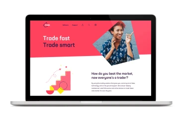
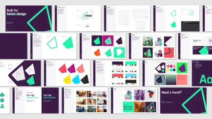
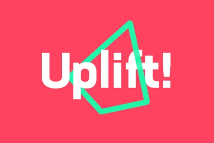
The icon suggests movement and uplift, like an arrow heading in a positive direction or, with a bit of imagination, a rocket ready for take–off. The angle in the motif is a small nod to the previous logo. It also forms a distinctive framing device for photography and can sit alone as its own recognisable icon.
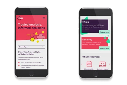
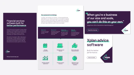
The typeface (Barlow) helps the identity work much harder in less space, handy for smaller digital spaces. The vibrant colour palette reflects the brand values of strong, hungry and desirable. Illustration and photography create a more personal feel and communicate the uplifting effect of Iress’ technology.
Overall, the new identity presents the Iress brand as more accessible and relatable. It helps the entire business focus on its overarching purpose – higher performance every day.


Transformation
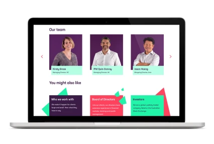
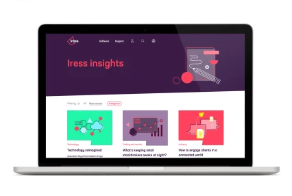
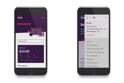
After 8 months of collaboration and iteration, the new brand was ready for rollout. The initial focus was the website.
There’s still more to do. Like helping bring more coherence to Iress’ offer across its global 1950+ employee business. And developing how the brand should shape the company’s pitch of its software solutions.
But for now, the solid brand foundation and uplifting visual style gave us a platform for re–introducing Iress as the brand making technology that helps the financial services industry perform better every day. The design and content marked a step–change from where Iress had been. Fragmented to unified. Tactical to purposeful. Feature–based to benefit–driven.
The end result? Relevance recaptured for one of financial technology’s founding fathers.
Take a look at more of our brand work in the financial services sector
