Taking design to the edges

A mission organisation that aims to connect with people on the margins.

Church Mission Society - Taking design to the edges

Introduction

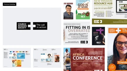
Church Mission Society (CMS) came to us with a challenge. They had carried out a substantial review of the organisation, aiming to return to their roots and re–launch their brand identity. Through the process they had articulated a very clear sense of who they are and what they stand for. But they needed a way to visually translate their renewed brand story. Sparks looked to refresh and refocus the visual components of the brand.

Challenge

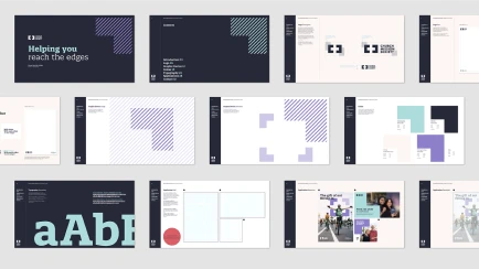
Sparks worked collaboratively with CMS, identifying the current visual approach was doing too much. Using too many colours across disparate channels, and dependent on a photographic style that was proving hard to sustain. Rather than scrapping what was a relatively new logo, Sparks simplified around what was working and explored what new possibilities emerged.

Action

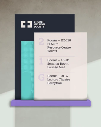
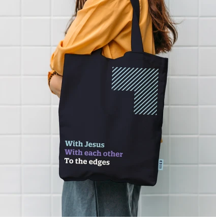
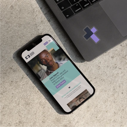
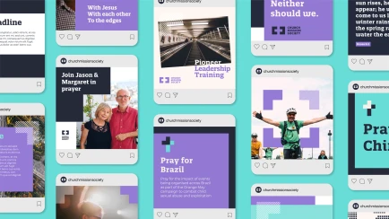
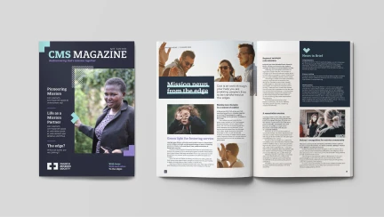
Sparks expanded the logo, developed graphic assets and refined the brand colours as well as introducing a impactful typographic system. Creating a fresh visual style to represent the charity’s desire to work on the edges. The result is a subtle but dynamic evolution of the brand that perfectly encapsulates the charity’s vision.

After sparks initial rebranding of the logo, graphic assets, typography, colours and overall direction and concept, we worked with the Comms team at CMS in collaboration to design the ongoing brand collateral.

RESULT

“Working with Sparks has been maybe one of the best decisions we made as an organisation. From the very start Sparks “got us” inside out and their whole process and collaboration with the in-house team has been second to none. They listened. They asked questions. They included us. From their initial design concepts and ideas to the final product, we have been so impressed with how they visually interpreted our brand strategy - which was no easy feat - into something simple and clear, yet visually creative. To say we are extremely pleased with the end result is an understatement.”

Dan Misson, Senior Graphic Designer

Our use of cookies

This site relies on cookies to work. We'd also like to set optional analytics cookies to help us improve it.

You can read more in our Cookie Notice

Necessary

We use cookies to protect our site and users, and to enable necessary functionality.

Analytics cookies

We would like to set Google Analytics cookies to help us to improve our website by collecting and reporting information on how you use it.